
Val Erde of the Colouring the Past blog recently sent out an invitation to bloggers to try her colorization services for free. I’d seen what she did for Luanne of The Family Kalamazoo and so was intrigued by her offer. Under the terms of her invitation, she would select an appropriate black and white photograph, and if I approved of her choice, she would colorize it.
Val selected a wonderful photograph of my great-aunt Betty Goldschlager Feuerstein, my grandfather’s little sister. I asked Betty’s grandchildren if they were comfortable with having the photograph colorized, and those who responded were also intrigued. When I received Val’s finished work and shared it with them, the granddaughters all were thrilled and said that Val had brought their grandmother back to life. Unfortunately I never met Betty, but I also can see what a great job Val did.
Here is the original and Val’s rendition in color:

Betty Goldschlager Feuerstein
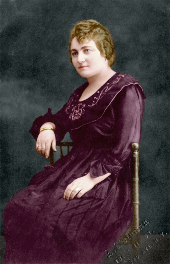
Colorized by Val Erde 2019
Pretty remarkable, isn’t it? Val will be available to respond to any questions or comments posted in connection with this post.

I am truly impressed by Val’s colourization of Betty’s portrait. We must not forget, however, that one needs a great b/w portrait to begin with to do a good colourizing job. Also living in the digital era, we need not touch the original photo, but simply make a copy for the colourization process. Val did a fantastic job in bringing Betty back in living colours.
LikeLiked by 4 people
I agree—there is much value in the original photo. It is the reality of what the camera captured. The color adds a different dimension that is different from that reality.
LikeLiked by 4 people
Nothing can detract from the original, Amy. 🙂 It’s why I always show the colourings with the original images.
LikeLiked by 2 people
Thanks, Peter. It’s very true that the original photo need not be touched – I only work digitally and don’t even use the original scans, but instead I make copies of them. However, it’s not necessarily true that one needs a great b/w portrait to do a good colourizing job… I’ve worked with some that have been in a truly dreadful state and done (in my opinion) well with them. As an example, have a look at the photo in my blog that I call ‘Elf Children’: https://colouringthepast.com/2017/07/14/elf-children/ and this one of a woman and a baby: https://colouringthepast.com/2019/02/08/woman-and-baby-in-front-of-window/
LikeLiked by 3 people
See comment on your blog. Best wishes! Peter
LikeLiked by 2 people
Beautiful work. It does bring her to life but there is something about the old black & white and sepia photos that I just love.
LikeLiked by 4 people
I love the old ones also, and as I said to Peter (above), those are the ones that are the most accurate reflection of what the camera saw.
LikeLiked by 1 person
Thank you. I love the originals too. I did a post recently that might help explain some of this: https://colouringthepast.com/2019/06/12/bertha-ryde-and-brother-more-colourings/
LikeLiked by 1 person
Thanks, Amy. This is quite remarkable. I would, however, add that when a photograph is colorized, it does change the history of it. So it must always include a note that it was colorized and the date it was colorized so that future generations do not mistake it for the original. Her dress is beautiful colorized, but is it accurate for the time period? We have no idea what the original color of her dress was, so by citing the date of the colorization, we won’t pass down incorrect information about the photograph.
LikeLiked by 3 people
That’s an excellent point, Ava. I am going to label the image of the photo that I received from Val (since it’s only a digital image, not an actual photograph or a colorized photograph) and also the image on my blog. Thanks!
LikeLiked by 1 person
Ava did make an excellent point, Amy. But labelling the image won’t help it be identified as a digital colouring as the captioning below the photo only applies to it while it’s in your blog. Once the image appears outside of your blog (for instance, in Google’s image search), or if someone downloads it from your blog, that text will be gone. If you like, I can put some text on the coloured photo itself but, as I said to Ava, copyright text can be removed by particularly determined people.
LikeLiked by 2 people
You’re right, Val. We can only do so much. Thanks for all your responses. Very interesting! Lots of important issues.
LikeLiked by 1 person
Please don’t put text on the image. My reference to labeling it was within the context of putting the image in a family tree or book. Because color photographs in the form of autochrome did exist at the time, it wouldn’t be correct to not label the colorization as a modern addition to the original. For purposes of genealogy research, any alteration of the image should be documented but not on the image itself.
LikeLiked by 1 person
Ava, then how would we deal with the problem of someone simply downloading the image without the caption? That is the most likely way that these images will be distributed in today’s world.
LikeLike
I’m not a technical person but I do know that there are ways to embed information so that photos cannot be downloaded or printed. If you really don’t want people to take a photo off the Net then the only real way to avoid that is to not put it on in the first place. It’s a sticky wicket. That’s why I’m not in favor of altering photos. But the colorized ones are nice and many people like them. So it’s an individual call.
LikeLiked by 1 person
I am not aware of anything that prevents someone from downloading a photo on a blog. Do you know who might know? I generally have a watermark on my photos and a copyright notice on my blog, but I know that that does nothing to scare off those who are determined to steal the work of others.
LikeLike
Sorry, I have seen it on photos but have never done it myself so I don’t know the mechanics of it.
LikeLiked by 1 person
Thanks, Ava. You make a very good point about something that bugs the hell out of me when I see what purport to be original colour photos (such as autochromes and their ilk) and find out they’ve been digitally coloured. People really SHOULD put on the photos that they’ve been coloured as otherwise they’re very easy to mistake for the real thing. However, it’s very easy to remove copyright text so if someone really did want to pass something off as real, that wouldn’t help. Alas, that’s just a fact about the internet and some of the people who use it for the wrong reasons.
These colourings are not intended to take the place of the originals. And, I cannot know the true colours, you’re right. But yes, this colour is true to the period. Also, Amy told me that – according to her relatives – in later years apparently her great-aunt Betty used to love wearing pinks so, knowing that people tend to develop their later tastes based on what they liked when younger, I went with that and went with a warm palette. It’s quite possible to do the necessary research when starting out. There are museums dedicated to displaying antique and vintage clothing and, providing one takes fading and staining into account, it’s possible to use what one has learnt from them to provide a good basis. And of course there are also other, mostly online, resources available. I’ve been digitally colouring photos since I first had a computer and a graphics program – quite a long time now – and over the years have built up a kind of instinct for what to use.
As for the digital colouring changing the history of a photo – I like to think of it as a peek into a possible past, rather than an actual delve into history. I always display my colourings, in my own blog, beside the original and I mark them as colourings and restorations. If you have a look at the link I gave to Debi Austen, you’ll be able to read my thoughts on originals vs. colourings and restorations.
LikeLiked by 2 people
Thanks for posting this, Amy. I’ll reply to the comments a little later – some interesting points made in them. 🙂 Glad you – and your cousins – are happy with the colouring.
LikeLiked by 1 person
I look forward to reading your responses, Val.
LikeLiked by 1 person
Wonderful! It really does bring her to life!
LikeLiked by 2 people
Thanks!
LikeLike
Thank you!
LikeLiked by 1 person
Amy, the difference between the two photographs is amazing. However, I personally do not like to see this kind of touch up work. Mainly due to the point Ava brought up about our not really knowing if the colors are right – not only for clothing but also hair color. Some exceptions would be uniforms were colors were known, clothing or scraps of clothing which were saved, and eye and hair color mentioned in documents.
LikeLiked by 1 person
It’s so interesting to read the different reactions. I definitely can see the issues with colorization, but also enjoy seeing the possibility of what the colors might have been.
LikeLiked by 2 people
I think I have just seen too many which were not as well done as this one.
LikeLiked by 1 person
I did hate when they colorized old black and white movies. And I’ve seen some terrible “tint” jobs done in the old days. But this one looks quite realistic, and the granddaughters certainly felt it was quite accurate in terms of coloring.
LikeLiked by 1 person
Most important is that they are happy with the results.
LikeLiked by 1 person
Exactly.
LikeLiked by 1 person
Thanks for your comment, Cathy. Most of what I’d like to say to you in reply, I’ve said to Ava, so maybe read my reply to her? And just to add a bit to that, Amy’s relatives were helpful with hair colour of Betty from when she was older, as they knew her, so I had a fairly good idea of the correct colouring. This is one of the reasons I always involve people in the colourings of their family photos. Where there is knowledge of relatives, often passed down, it’s helpful to know of it. But think about this: even with black and white or sepia photos, we can’t know the exact colours people were wearing on any given day, we just have to imagine it. It’s never been and never will be my intention to detract from the originals – either the subjects or the photographers’ skill or choices.
LikeLiked by 1 person
Val, my comment was not meant as criticism of your work. I appreciate the background research you put into this project and the family’s satisfaction is most important.
LikeLiked by 2 people
Thanks, I understand. 🙂
LikeLiked by 1 person
It has been interesting reading the comments with this posting. I love the colorization job that Val did. The highest of quality for sure (I think so) I love both photos and feel they have equal value along with all that has been pointed out. I was intriqued with the hint of the (is that a) double pearl ring on the right hand? One precious treasure was a double pearl ring of a grandmother that was handed down to me and now me to a daughter. There is that single diamond solitare ring too, I wonder if this could be an engagement photo?
LikeLiked by 2 people
You have a very sharp eye for details, Sharon. I wonder if you are right that it was an engagement photograph. Betty was married in June 1921; she was 24 years old. I am a terrible judge of age and clothing styles for dating photographs. Maybe Ava can help? Or Val?
LikeLiked by 1 person
Yes, she could be early to mid twenties. That hadn’t occurred to me that it was an engagement photo! What a great thought!
LikeLiked by 1 person
Thanks!
LikeLiked by 1 person
1921 is about right. She does look about 24. Just the fact that the ring is displayed prominently is a giveaway that it was most probably an engagement photograph.
LikeLike
I just found this in my comments folder. Sorry for the delayed response. Thank you!!
LikeLike
Thanks, and I’m so glad you mentioned the double-pearl ring. I’d wondered about that (and in fact I’ve just coloured another person’s photo with that same feature).
LikeLiked by 1 person
I think Sharon has it – there’s a lovely diamond solitaire on Betty’s left hand. The clothing is right for the early 1920s – the collar would have been stiffened and then beaded. I come from a long line of packrats and my own grandmother had a dress of a similar style. (She never threw out ANY thing!) And I love the color Val chose – absolutely perfect.
LikeLike
I am just seeing this comment for some reason—thank you so much! I appreciate your insignts. Sorry for the belated response.
LikeLike
Amy. That is amazing. So cool
Sent from Robins iPhone
>
LikeLiked by 2 people
Grandpa’s little sister!
LikeLiked by 1 person
I love when blogging works like this; with so many thoughtful comments and pieces of information. I feel I’ve really learned a lot. Well done to Val — beautifully done colourisation.
LikeLiked by 2 people
I agree, Su. I love when the community aspect of blogging allows us all to share our thoughts and experiences.
LikeLiked by 2 people
It’s my favourite aspect of blogging. 🙂
LikeLike
🙂
LikeLike
Thanks, Sue. 🙂
LikeLiked by 2 people
Amy and Ava – this seems to be a good resource about copyrighting photos online, what you can and can’t do: https://www.cambridgeincolour.com/tutorials/protect-online-photos.htm
LikeLiked by 1 person
Oh, I know all about copyright—I taught it for 30 years! I thought Ava was referring to some technology that prevented someone from downloading an image found online. Copyright law can’t do that, and suing someone for copyright infringement is more trouble than its worth for a random photograph.
LikeLiked by 1 person
There is some software that can be used, and that link gives some info on it. 🙂
LikeLiked by 1 person
OK, I will take a look. Thanks!
LikeLike
Well, I looked at that site, and the “technical” fixes like adding tiling or layers are not explained well, and I have no idea how to “change the HTML code” on my images. Nor do I know how to disable right-click functionality. I wish the author had at least provided links to sites that would explain those things. At any rate, I will just keep hoping that people won’t steal images.
LikeLike
I suppose, really, that the info is aimed at people with self-hosted blogs rather than those, like us, on WordPress.com – self-hosters have more control over their blogs. That said, a certain amount of HTML can be altered even here in the other tab of the post editor.
LikeLiked by 1 person
I wouldn’t know how to alter HTML no matter what or who was hosting my website!
LikeLiked by 1 person
Ah, when I first started blogging back in 2004, I had to learn some HTML to use the blog where I had it. 🙂
LikeLiked by 1 person
I am always more partial to a photo. Since the photo is in good condition the colorized portrait is just like a painting. I like it but at the same time I prefer a photo. I’d prefer getting the photo restored to having a portrait in color. It feels somewhat removed to me. Still lovely all the same.
LikeLiked by 1 person
Both of your comments came through. I always moderate comments, but alas, I am not always at my computer, so sometimes there is a lag between a comment being made and being approved and published. Sorry!
LikeLiked by 1 person
I do not know if my previous comment got through. Here is a refined version with some added input.
Betty looks beautiful in the colorized image. It reminds me of a portrait and it can be framed and displayed with great joy and pride.
I’m not a digital artist but I’d say the success of this colorization is due to the very good condition and clarity of the original B&W image.
I think having an old photo colorized is a matter of personal preference. It should be up to the person and their choice respected.
For myself, it is a matter of limited financial resources. This is an expensive pursuit or hobby or lifestyle, whatever you make of being a family historian. If I had to make a decision, I’d go with having an original photo restored as best as possible. Having that available can then bring the possibility of a colorization within the reach of family who might want to choose that option on their own.
I treasure the colorized photos that were made during the time period the photo was taken. My Mom paid for studio portraits taken before her graduation from high school. She also had them colorized and told me how she went over the proofs and was very particular about the results. In this sense I get a bit of her aesthetic and sensibility through the approved colorized photo. It also draws us into the sensibility of that era (1947).
Modern colorizations are different. They can recreate a sense of what it was like and should be taken at that.
As much as I like the colorized portrait of Betty I prefer the B&W photo. Just my preference.
LikeLiked by 1 person
Obviously you are not alone in your preference. As I’ve commented before, I see the benefits of colorization and also the possible downsides if people are misled. As someone interested in history, I would never post the color version as a substitute for the black and white version, but I do see the beauty of adding color.
LikeLiked by 1 person
What a beautiful woman your great aunt was, Amy! Val has done a wonderful job of colouring it, as usual.
LikeLiked by 2 people
Thank you, Clare!
LikeLike
😊
LikeLiked by 1 person
One of your posts that I missed! I hate doing that. It’s been a crazy last few months. This colorization is just stunning. She looks beautiful! You must be thrilled with it.
LikeLiked by 1 person
I am, and even more importantly, her granddaughters—who knew her whereas I never did—were thrilled. Thanks, Luanne!
LikeLiked by 1 person
I can imagine! What a wonderful gift for them!
LikeLiked by 1 person
Yes!
LikeLiked by 1 person